Singular Wings Medical
Overview
Singular Wings Medical builds digital health products and apps that monitor vital signs through biomarkers. I was asked to rebrand the company: a logo and visual language that position it for the market it now serves, while keeping a connection to its past.
The project
The challenge was to modernize the brand without cutting its roots. Since the company name is very long, the client and I decided to build the logo on the acronym SWM and keep the full name beneath it.
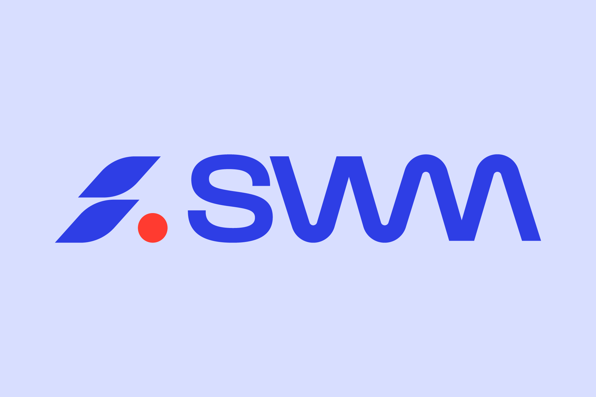
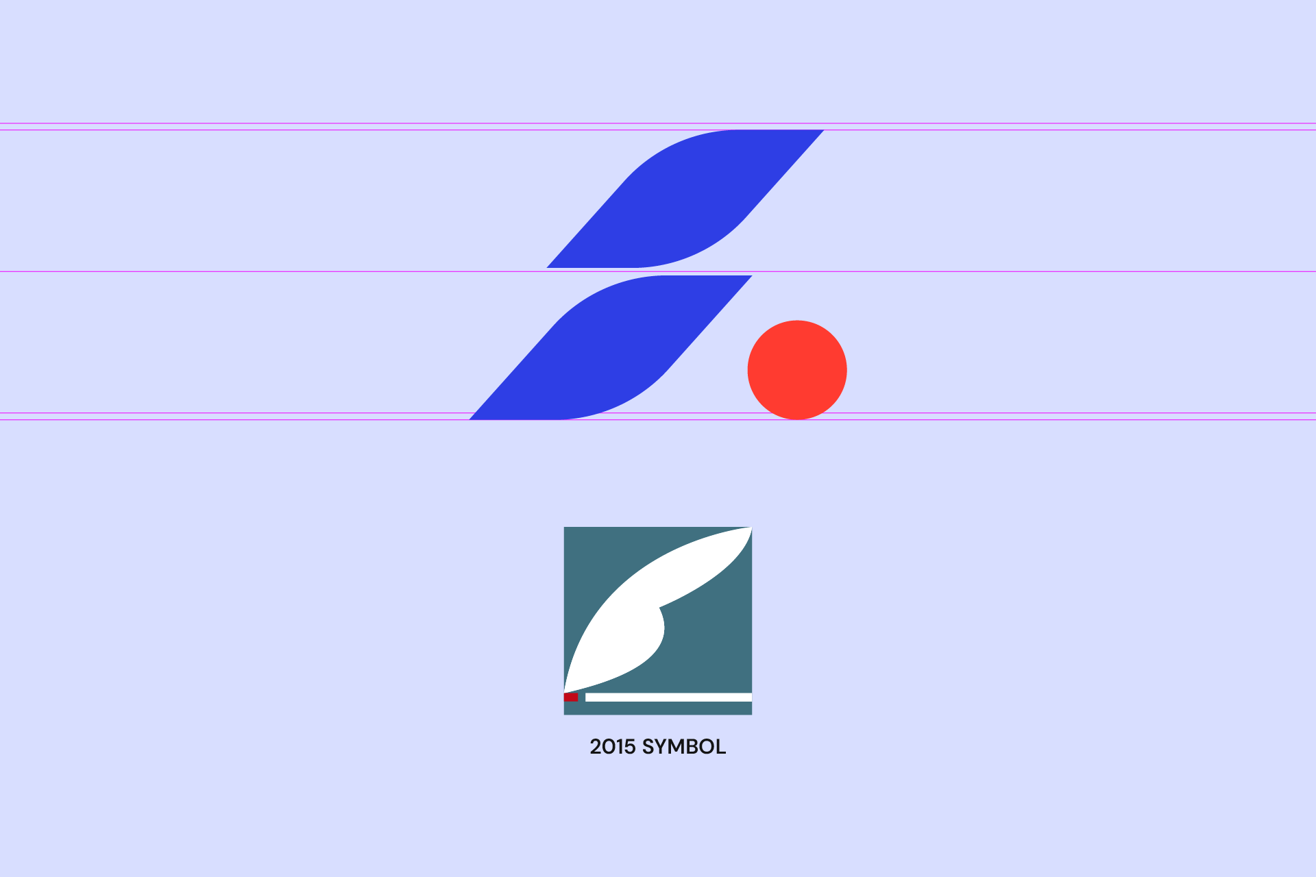
From the 2015 symbol I kept the wing and the singularity and freed them from their frame. Without the frame, the symbol reads lighter and more dynamic. The red dot grows out of a small red mark in the 2015 symbol. For the wordmark, I found the answer in the company’s core technology, the biomarker wave. The W and M merge into one continuous stroke that rises and falls like a biomarker curve. The trade-off was deliberate: a less conventional monogram, in exchange for a mark that explains the company in a single line.
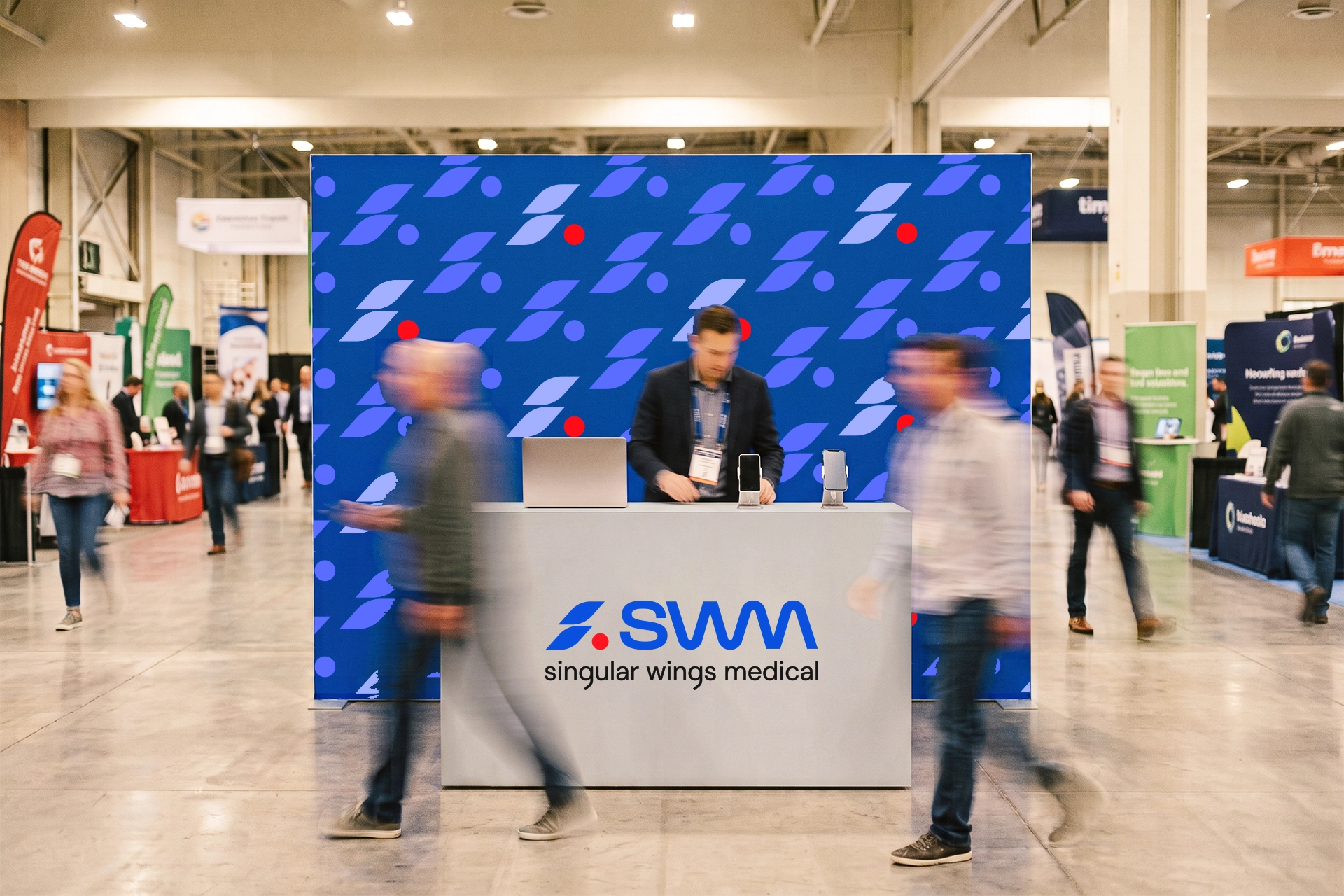
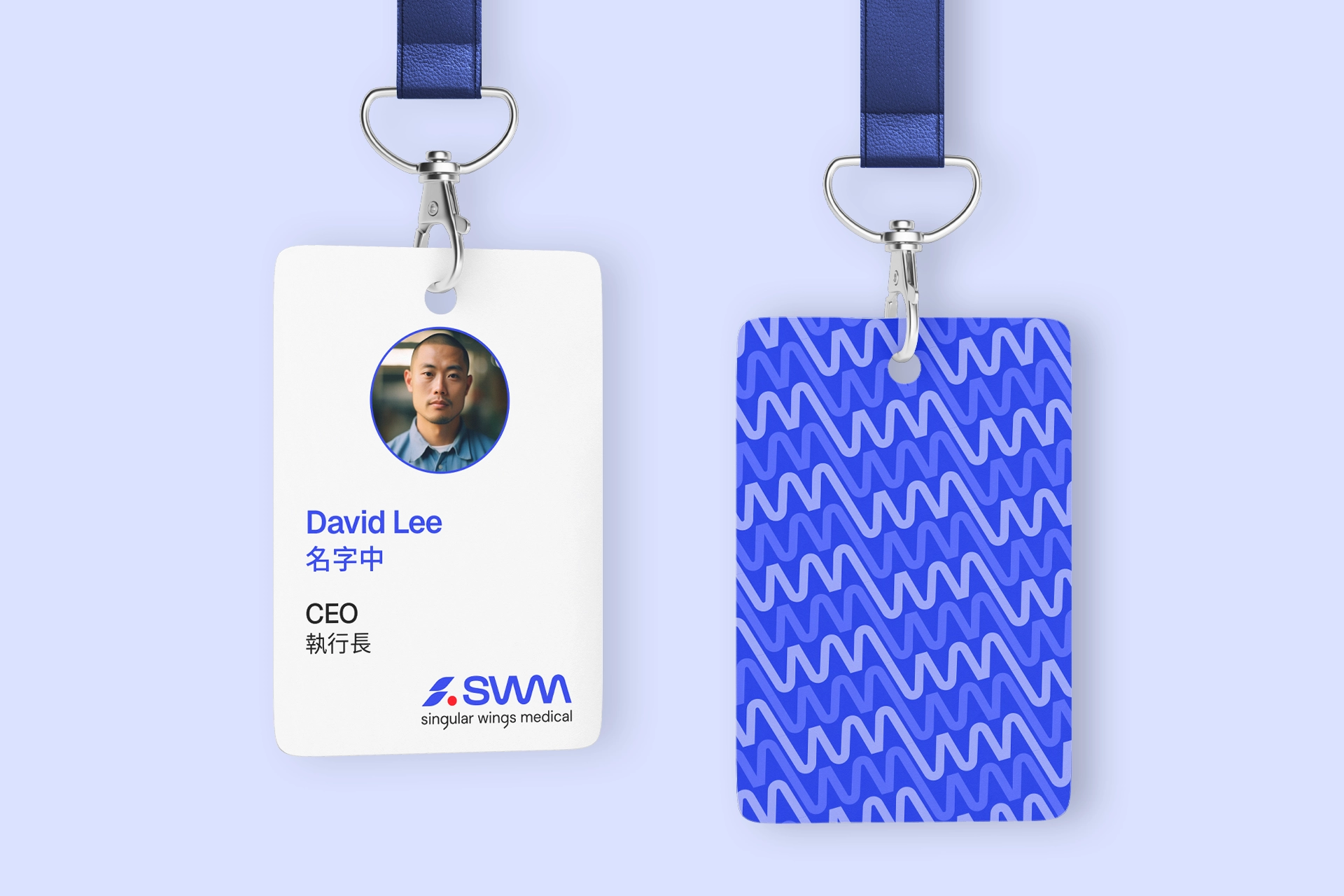
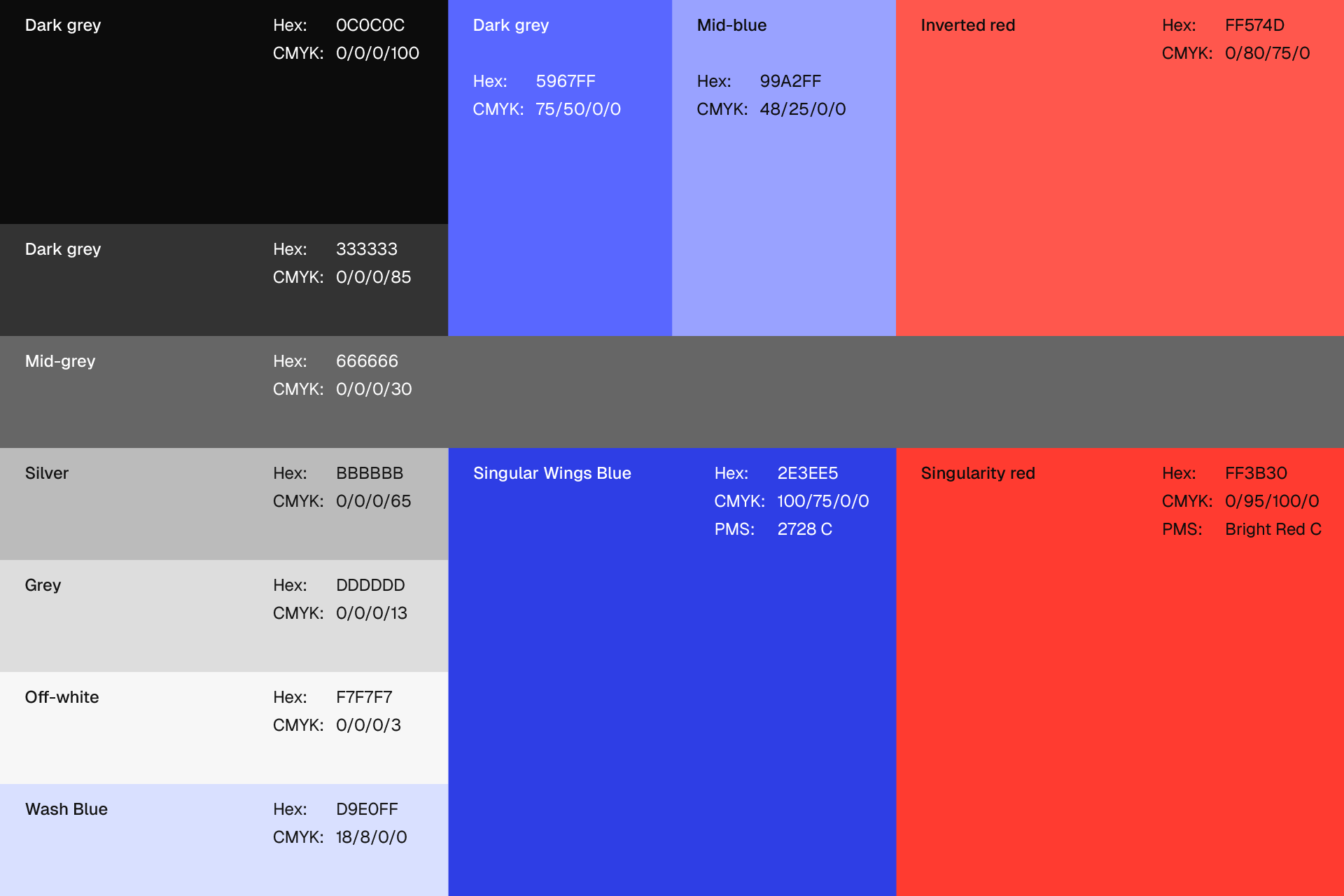
The color system took time because it had to look the same on screen and in print. The client and I settled on a digital blue that carries trust and a red that conveys the passion driving the company. A scale of grays supports them, staying quiet so both accents stand out. Finally, I built graphic patterns from the logo’s own elements. They give the brand textures to decorate with and extend the brand’s visual language.
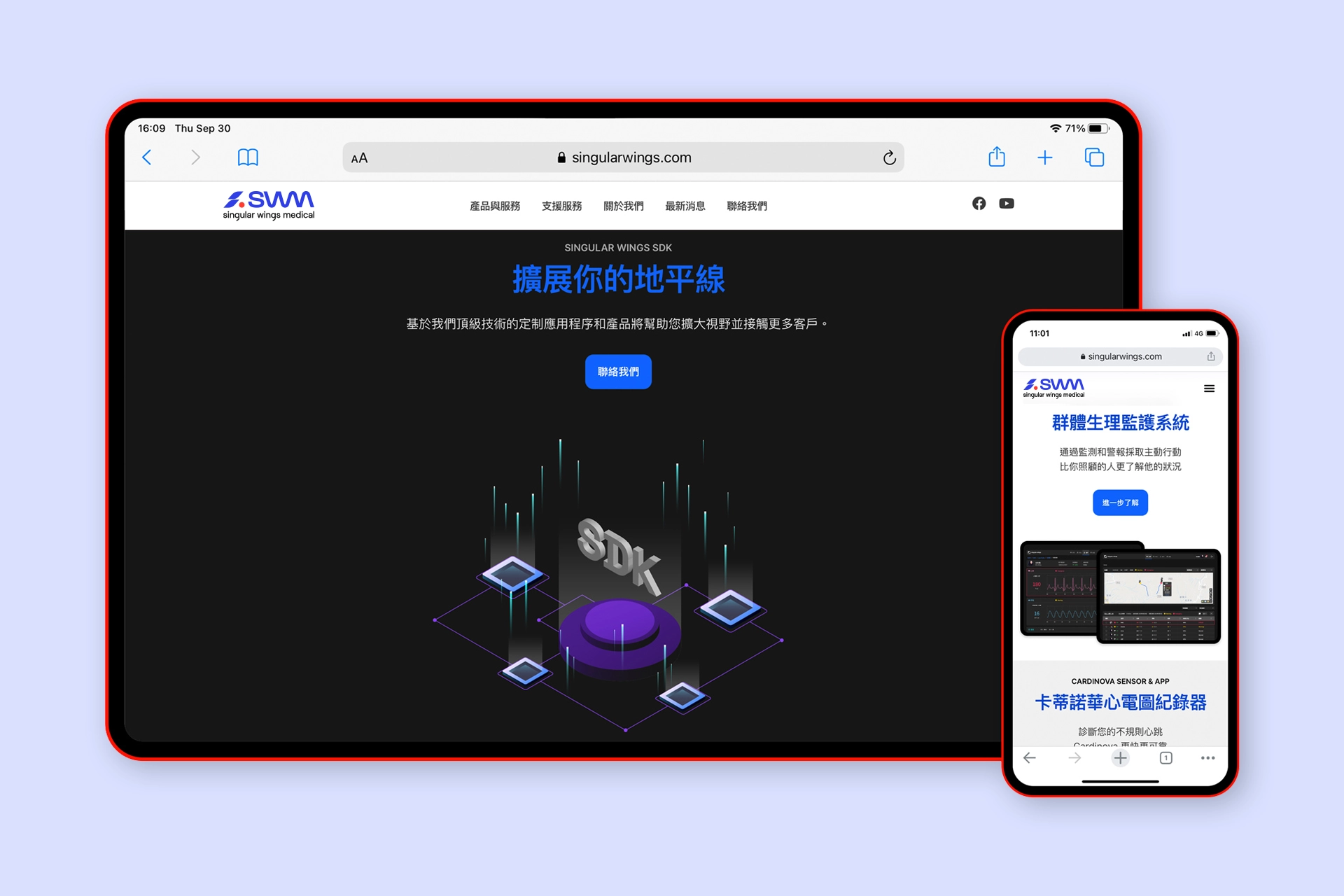
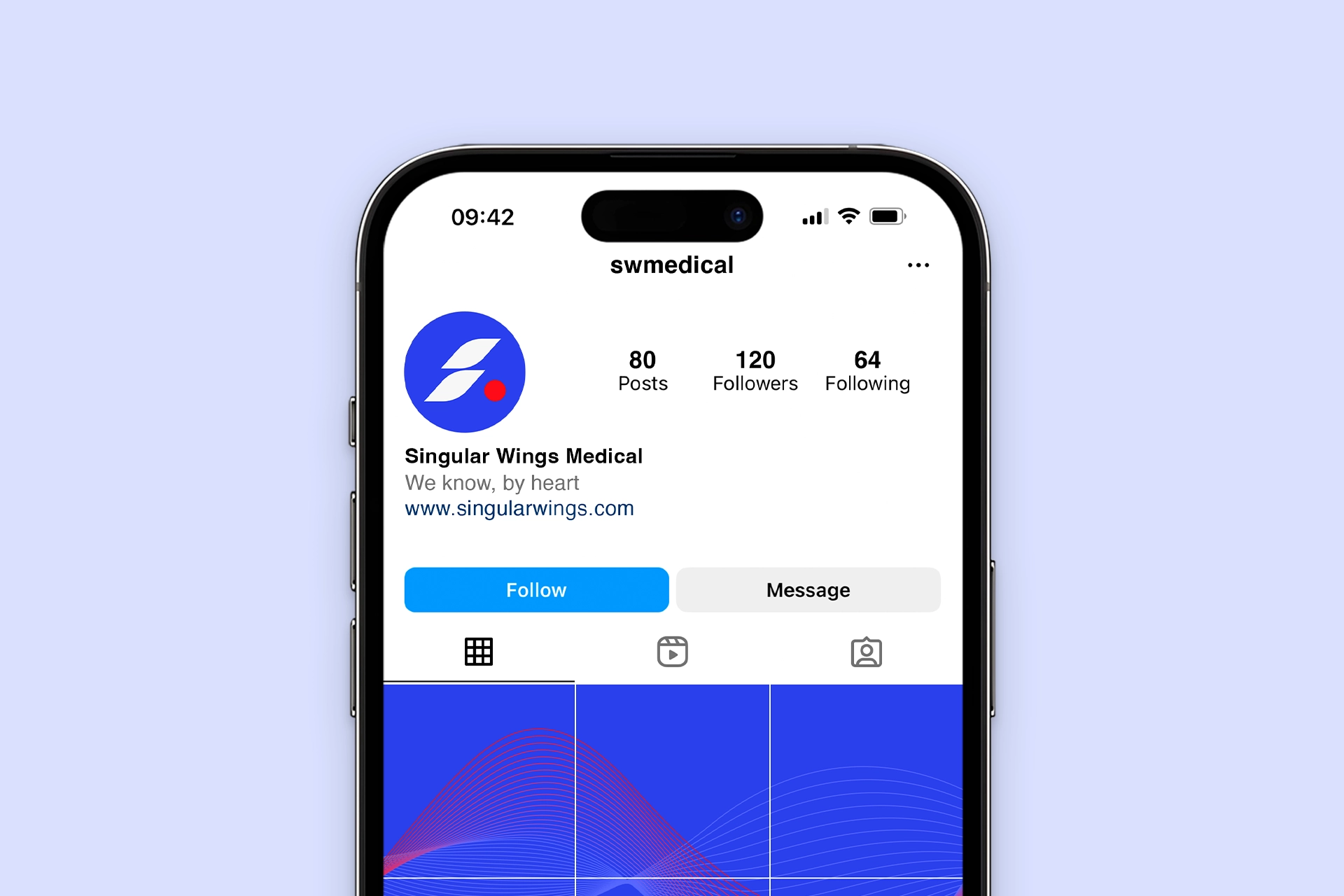
The identity now explains what the company does before anyone reads a word. The wave, the singularity dot and the wings all trace back to the company’s roots and carry it forward across screen and print.